Notes on International Klein Blue
One day in 2022, I visited the San Francisco Museum of Modern Art, and I saw one of Yves Klein's monochrome blue paintings in person for the first time. Here is a photo that does zero justice to what I saw.

I had learned about Klein in art history class, and sort of wrote him off as one of the weird midcentury gimmick guys, like Rauschenberg and Malevich. I still don't know about those other guys, but unexpectedly, Klein legit knocked me on my ass.
International Klein Blue is, without a doubt, the most beautiful colour that I’ve ever seen. The screens and photos will never do it justice. I think this photo comes the closest to capturing what it's like, the otherworldliness of it:
The more I looked, the more spellbinding it was. The paint was thick, pastelly and a little gritty, and you can see bumps of it on the canvas, giving it wonderful depth. The shadow that the little bumps cast were somehow a subtle gorgeous lilac that seemed almost brighter than the blue, which delighted and shocked me. After noticing this, for the rest of the day, my eyes felt infinitely more attuned to the shade that various colours turned when they were partially enshadowed, and that lead to a dozen more moments of awe.
From 1956 until his death six years later, Klein worked almost exclusively with this blue pigment. He was famously obsessed with it. And having at last seen it in person, I finally understood.
Sometime after my visit in 2022, SFMoMA put his pieces back into storage and they have not come out again. I check on their website every time I fly back to the Bay, and my heart falls whenever I see that the status of IKB74 remains not on view at this time. But I understand; Klein's blue pieces are notoriously finicky and delicate.
Here's what one conservator says about working with Kleins:
The paint layer in Yves Klein’s blue monochromes is underbound, i.e. it has little binding medium and densely packed, partly exposed pigment particles (that is, they are not surrounded by binding medium). When introducing a consolidant, one has to be extremely careful not to saturate the paint (which makes it appear darker) or change the gloss of the paint surface.
Another one says:
Yves Klein’s pristine monochrome surfaces are very difficult to preserve. The original resin is not only fragile but, just like any opaque paint, the binder does little to protect the pigment close to its surface. The paint’s matt granular finish is extremely easy to smudge or abrade. In addition, they tend to trap air-born particles such as dust, which is very difficult to remove, even with a soft Japanese brush. Please follow my advice and do not attempt such endeavor. It is better to leave it on the hands of a professional.
and:
My best advice to preserve Yves Klein pieces is to keep them under glazing, such as plexiglass UV-treated box.1 A climate control vitrine or frame can keep the artwork free from occasional abrasion and dust. But remember, this display cases are not 100% sealed. And never place Klein’s pieces close to a window or an air conditioning outlet, and always keep them far away from pollutants that may be coming from the kitchen. Also, keep in mind that you should never pick up Klein's pieces with your bare hands or even with cotton gloves. Nitrile gloves are much better.
You get the idea. International Klein Blue is not a regular paint. You see, his innovation was not the pigment, but a new medium that allowed it to be displayed in all its glory.
In his own words: "What pleased me above all were pure pigments in powder like the ones I often saw at the wholesale color dealers. They had a burst of natural and extraordinarily autonomous life.... What upset me was to see this incandescent powder lose all its value and become dulled and lowered in tone once it was mixed with a glue or whatever medium was intended to fix it to the support." (Haiml 2007)
The pigment that made up International Klein Blue was ultramarine blue.

Through much of history, it was made from lapis lazuli, a semiprecious stone that was exclusively mined in a strip of mountains in northern Afghanistan. Its rarity and the difficulty of its processing made it more expensive than gold.
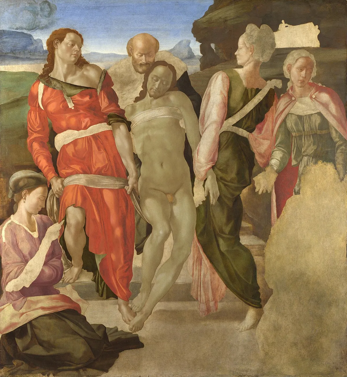
Some believe Michelangelo's The Entombment went unfinished because he was unable to source enough of it.
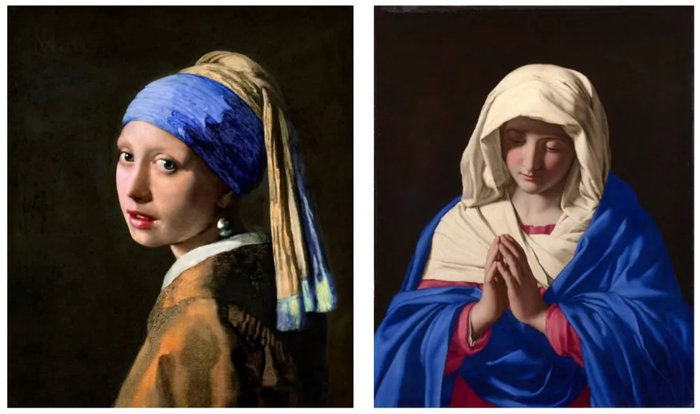
Traditionally reserved for the Virgin Mary's cloak, Vermeer used it for everything and bankrupted his family. The pigment in the blue headwrap of Girl With A Pearl Earring was about as expensive as gold, ounce for ounce. Then the painting was named after something painted with lead white, a much cheaper pigment.
Here is a webpage featuring many more historical uses cases of the pigment.
In 1828, the first synthetic alternatives were brought to market. (Yves Klein was born one hundred years later, in 1928.) By the 1870s, it was in common use.2
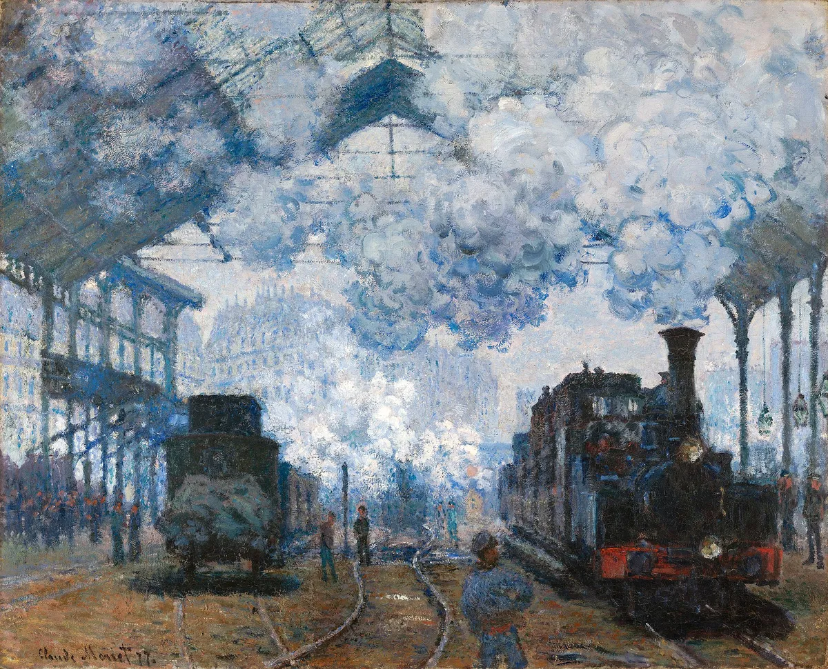 Monet - The Gare Saint-Lazare, Arrival of a Train (1877)
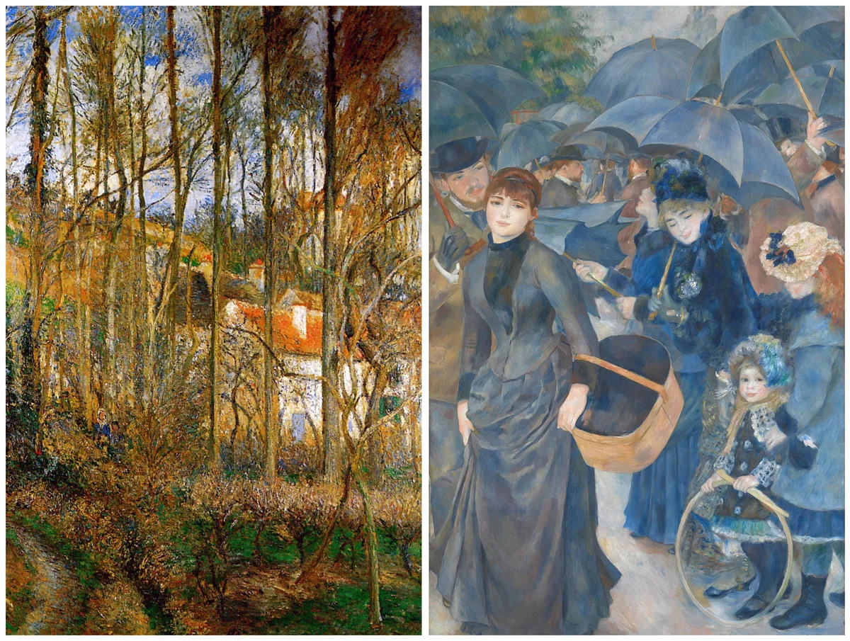 Pissarro - The Côte des Bœufs at L'Hermitage (1877), Renoir - The Umbrellas (c.1881–86)
Today, a pound of the synthetic stuff goes for $30 to $150 depending on quality.
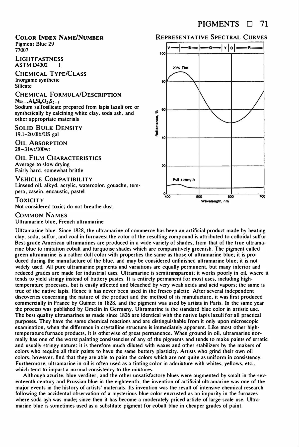
Synthetic ultramarine blue is created by heating a mixture of clay, soda, sulfur, and coal in a furnace. The best quality synthetic pigments are functionally identical with the ones made from lapis lazuli, down to the chemical reactions when the pigment is mixed with anything.
This is unfortunate, as ultramarine blue is a total pain in the ass to work with. It likes to turn dark and stringy, and requires dilution with waxes and other stabilizers in order to be useful. With the addition of all these binders, it loses the vividness it has in powdered form.
 Ralph Mayer, The Artist's Handbook of Materials and Techniques, 5th ed.
So Klein, who adored the pigment, went looking for new binders. He tapped the owner of his regular paint store, Edourard Adam, to help. Adam in turn tapped the french chemical company Rhone-Poulenc, who suggested a colorless polyvinyl acetate resin, Rhodopas M. They found through experimentation that a 60 percent solution in 190-proof (95 percent) alcohol worked best. This solution was sold as Rhodopas M60A. Mixed with a tiny amount of ethyl alcohol, the resin suspends the pigment without altering it, and then shrinks significantly while drying, leaving behind a gritty and bumpy surface of the deep, deep, blue.
While this research was going on, Klein also exhibited several artworks featuring pure, unbound pigment. In one of them, a low trough containing the pigment powder was installed on the floor, and visitors were invited to create textures on the surface with a small rake.
His blue monochromes were executed on unprimed linen canvas stretched around a piece of plywood. The plywood gave it a solid backing, which was necessary because he applied the paint mechanically with a lambskin roller. (He rejected brushes as "too psychological", preferring the rollers that allowed him to create more of a distance between himself and his canvases.) Where the roller bands overlap, he would go over the piece with a fairly dry roller before the paint had completely dried. They had to look perfectly pristine.
When a journalist asked him about the happiest day of his life, Yves Klein replied: 'S'il y a un événement précis qui m'ait vraiment rendu heureux, j'opterais pour cette réussite de capture de ce Bleu que je désirais unique au monde.' ("If there is one specific event that truly made me happy, I would choose the successful capture of this Blue that is unique in the world.")
I'm so glad he succeeded. I am slightly less glad that his works go for eight figures today.
But the paint shop he collaborated with to create the medium is still around, and it will happily sell you the specific resin Klein used. Prepare to pay that amount again in shipping, however, and then once more in tariffs.
But after you do, you can make the Blue at home3.
To be continued :)
Sadly, New York MoMA took the advice of this last curator, and while their blue monochrome is on permanent exhibition, it is sealed behind thick UV-treated plexiglass, which bends the light around it and glares horribly.↩
A previous version of this blog post repeated the factoid that JMW Turner was the first accredited artist to use the pigment. This is actually false. Turner was a known neophile who experimented with all the pigments that were first manufactured in his lifetime, and while synthetic ultramarine was found in one of his palettes, there is no evidence that he ever used them in his works, exhibited or otherwise. For more on this, refer to Townsend's 1993 Turner's Painting Techniques. This error has now been reflected on my mistakes page.↩
Or anywhere else.↩